Cocoa Packaging Design
Chtěl jsem si více procvičit produktovou vizualizaci bez toho, abych dělal reklamu skutečné firmě, a tak jsem si vymyslel vlastní značku.
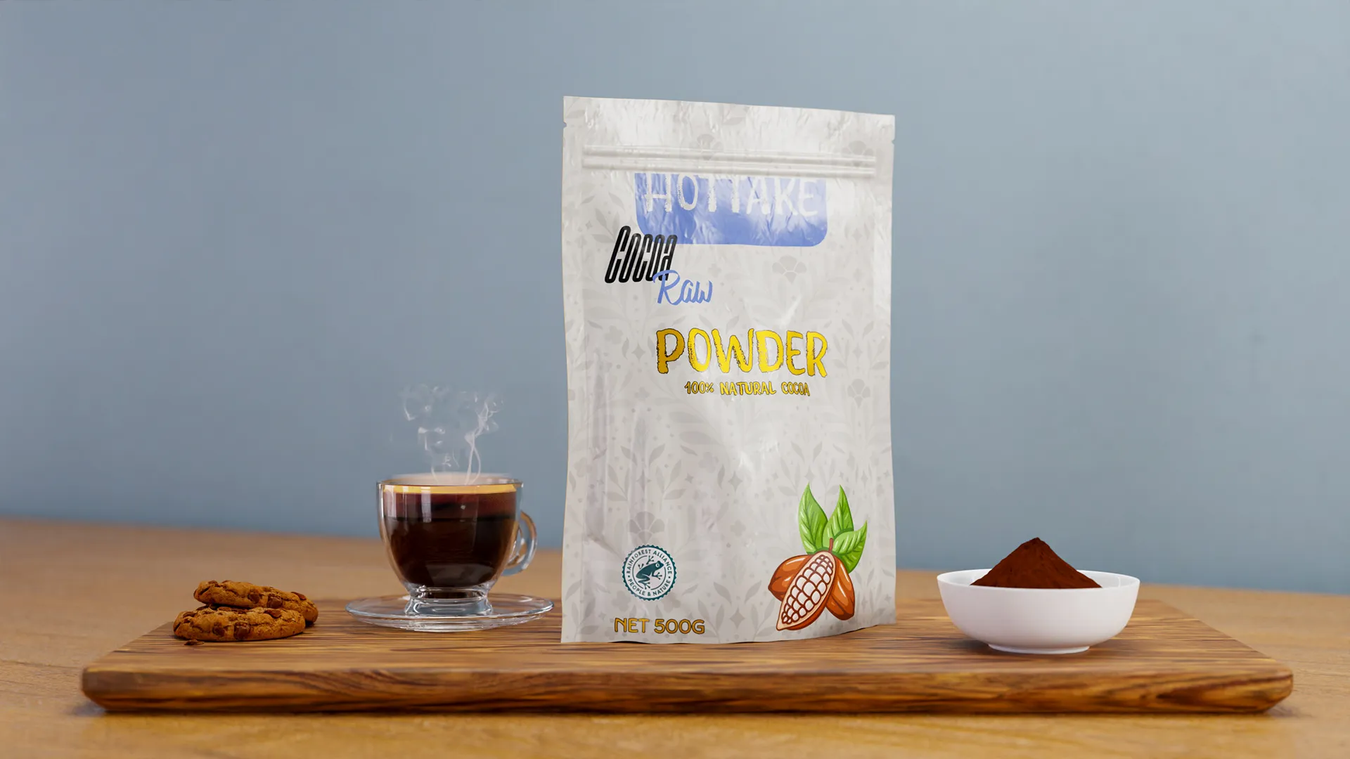
Po projektu s Dior Sauvage jsem věděl, že chci udělat další produktový záběr, ale nechtělo se mi dělat zadarmo reklamu další skutečné značce. Rozhodl jsem se vymyslet fiktivní brand čistě proto, abych měl co renderovat. Tak vzniklo HOTTAKE, tahle imaginární značka kakaa. Ten název mi přišel jako docela vtipný nápad pro rychlý jednorázový projekt.
Moje hlavní soustředění pořád směřovalo k finálnímu obrázku, ne k samotnému designu značky. Chtěl jsem vytvořit spíš lifestyle fotku přímo v Blenderu než jen sterilní produktový snímek. Návrh obalu byl sice nutnou a zábavnou součástí procesu, ale celé to sloužilo hlavně jako cvičení ve vizualizaci.
Plastový stojací sáček byl záměrnou změnou oproti lesklé lahvičce Dioru. Pololesklá fólie a měkké pomačkané švy znamenaly, že světlo muselo obtékat materiál místo aby se odráželo od ploché plochy, a spodní vyztužení muselo být čitelné, aby celá věc skutečně vypadala jako sáček a ne jako placatá nálepka. Etiketu jsem nechal jednoduchou. Zvolil jsem čisté bezpatkové písmo a barevnou paletu, která působí hřejivě a přístupně - držel jsem se odstínů hnědé a krémové s jedním výrazným akcentem. Cílem nebylo vyhrávat designové ceny, ale spíš vytvořit něco, co by vypadalo uvěřitelně na kuchyňské lince a nerušilo to celkovou atmosféru snímku.